Choose the right chart
Engineers often need to present the result of a work graphically. Choose the proper chart type is mandatory in order to give means to the data. Charts are an easy way to understand the data and give to it some real mean.
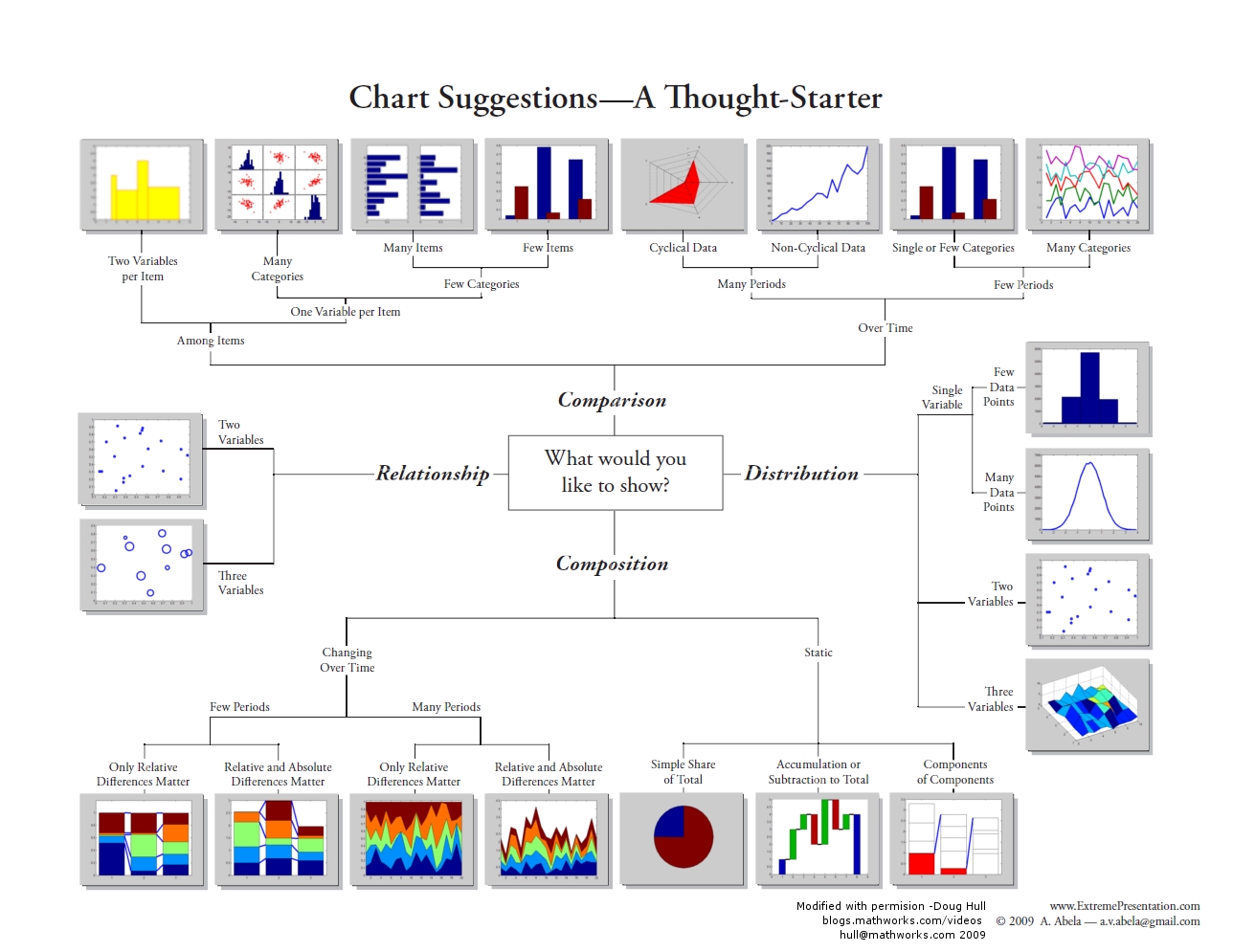
To support on this task Dr Andrew Abela published an amazing diagram that helps to decide which chart best fit to a given dataset and problem to outcome. Below is the Dr Abela’s diagram image.

A pdf version is available here. A monochromatic version of this diagram is available here.
Follow are some tips for the chart format:
- No non-zero axis scale on bar charts
- Make subtle grid lines (or remove them)
- Add labels to important points
- Add descriptive, bold titles
- Position axis, scales at the right places
- Use simple, easy colours
A company called Juice Analytics crate an online Chart Chooser application based on the Dr Abela’s work. Check it out!
Take a look on this post which gives more information about how choose the proper chart.
I hope that post be useful! Peace!!!🖖🏻